CSS 笔记
发布于 2026-04-06更新于 2026-11-143737 字31 分钟 · 阅读时间
2023-9-13 ~ 2023-9-20
写在CSS文件夹的 0.入门CSS(笔记).html 中
2024-12-1~2024? 2025-5-5最后编辑
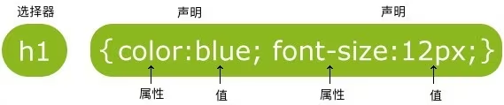
CSS 指层叠样式表 (Cascading Style Sheets)
样式定义如何显示 HTML 元素
样式通常存储在样式表中
把样式添加到 HTML中的样式表,是为了解决内容与表现分离的问题
外部样式表可以极大提高工作效率,其通常储存在 CSS 文件中
多个样式定义可层叠为一个
继续把原图下载响应也补上同样的 ETag/Last-Modified
json 是逗号,css 是分号
注释用 /* */
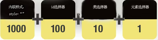
<!DOCTYPE html><html lang="en"> <head> <meta charset="UTF-8"> <title>Title</title> <!--style中的是css的代码,所以说html的注释回不生效,要用/* */”,当然,“ctrl+/”也可以--> <!--内部样式--> <style> h1 { color: green; } h2 { color: green; } </style> <!--外部引用(外部样式)--> <link rel="stylesheet" href="css/style.css"> </head> <body> <!--行内样式,在标签元素中,编写一个style属性,编写样式即可--> <h1 style="color:red">我是标题</h1> <h2>我是标题</h2> <h3>我是标题</h3> <br> <hr> <br> <p>行内规则:就近原则/覆盖原则</p> 因为代码是从上到下读的,后面的覆盖了前面的<br> 如上,若将link的放在内部的上面,则h2的颜色也会不一样<br> </body> </html>/*外部样式*/h1{ color:yellow;}h2{ color:yellow;}h3{ color:yellow;}<!DOCTYPE html><html lang="en"><head> <meta charset="UTF-8"> <title>Title</title> <style> /*标签选择器,会选择到页面上所有的这个标签的元素,比如无论有多少个h1,都会全部选中*/ h1 { color: #33e2d6; } p { font-size: 80px; } /* 类选择器的格式 "." + "class的名称 + "{}" 好处,可以多个标签归类,是同一个class,比如下面的标题3的class就是标题2的class的复用 标签最好是易读懂的 */ .changjiang { color: #33e2d6; } .huanghe { color: rgba(248, 66, 245, 0.98); } /* id选择器: ”#“+ “id名称“+ “{}” 特点: 必须保证全局唯一! 不遵循就近原则,固定的 按:id选择器 > class选择器(类选择器) > 标签选择器的优先级,如下图 */ #changjiang { color: #33e2d6; } .style1 { color: rgba(218, 108, 215, 0.93); } h1 { color: red; } /* “*”表示所有标签 */ * { margin:0; padding:0; } </style></head><body> <h1>学java的</h1> <h1>sakurakugu</h1> <p>真厉害</p> <hr/> <h1 class="changjiang">标题1</h1> <h1 class="huanghe">标题2</h1> <h1 class="huanghe">标题3</h1> <p class="huanghe">p标签</p> <hr/> <h1 id="changjiang" class="style1">标题1</h1> <h1 class="style1">标题2</h1> <h1 class="style1">标题3</h1> <h1>标题4</h1> <h1>标题5</h1></body></html>/* 可以用逗号一起来使用同一个属性 */h1,h2,p { color:green; } /* !important */.button { padding: 5px !important; border: 1px solid black !important;}三个基本选择器的优先级顺序
<!DOCTYPE html><html lang="zh"><head> <meta charset="UTF-8"> <title>Title</title> <style> /*标签选择器*/ p { background: green; } /*后代选择器*/ /*语法:*/ /*“祖爷爷”+ “空格“+ “爷爷”+ “爸爸“……+“{}”*/ /*1.*/ body ul li { background: #c233e2; } /*2.*/ body p { background: red; } /*子选择器*/ /*就是选择第一个的亲儿子,也就是它最近是下一个元素*/ body>p { background: #33e236; } /*相邻兄弟选择器 只有一个,相邻(向下)*/ /*用于选择class对应的名称的“兄弟”,也就是它的下一个*/ /*其中的“.xxxx”是本人,"+"后面的元素是要选择的对应元素下一个”兄弟元素*/ /*如:p1,p2; p7,p8*/ .active+p { background: #dac367; } /*通用选择器:当前选中元素的向下的所有兄弟元素*/ /*将“.xxxxxx”下面的同一级的所有相同“~”后的标签全部改掉*/ .active~p { background: #33e2d6; } </style></head><body> <p>p0</p> <p class="active">p1</p> <p>p2</p> <p>p3</p> <ul> 123 <li> <p>p4</p> </li> <li> <p>p5</p> </li> <li> <p>p6</p> </li> <p class="active">p7</p> <p>p8</p> <p>p9</p> <h1 class="active">h7</h1> <h1>h8</h1> <h1 class="active">h7</h1> <p>p8</p> <p class="active">p7</p> <h1>h8</h1> </ul> <p>p7</p> <p>p8</p> <p>p9</p></body> </html><!DOCTYPE html><html lang="zh"><head> <meta charset="UTF-8"> <title>Title</title> <style> /*选中ul的li,且li要是ul的第一个子元素*/ /*冒号前面的是要选中的标签*/ ul li:first-child { background: #33e2d6; } /*选中ul的li的最后一个子元素*/ ul li:last-child { background: red; } /*只选中p1:定位到父元素,再选中到它的第一个元素*/ /*意思:选中p元素的父元素,然后再选中那个父元素的第一个元素,并且1元素也要是p元素才生效*/ /*那个1改成2,就是选择第二个*/ /*p:nth-child(1){*/ /* background: blueviolet;*/ /*}*/ /*选择p标签的父元素,再选择它的子元素中的第2个p元素(即选择父元素,下的p元素的第二个类型*/ p:nth-of-type(2) { background: yellow; } /*这种所有带冒号的是伪类*/ /*hover:悬停*/ a:hover { background: #33e2d6; } </style></head><body> <a href="">123456789</a> <p>p1</p> <p>p2</p> <p>p3</p> <ul> 123 <li>li1</li> <li>li2</li> <li>li2</li> </ul> <ol> <p>p4</p> <p>p5</p> <p>p6</p> </ol> <ol> <p>p7</p> <h1>h8</h1> <p>p9</p> </ol></body></html><!DOCTYPE html><html lang="en"><head> <meta charset="UTF-8"> <title>Title</title> <style> .demo a { float: left; display: block; height: 50px; width: 50px; border-radius: 10px; background: #2700ff; text-align: center; color: gainsboro; text-decoration: none; margin-right: 5px; font: bold 20px/50px Arial; } /*存在id属性的元素*/ /*属性选择器的格式:a[]{}*/ /*如:*/ /*将a标签中带有标签属性的去更改*/ a[id] { background: yellow; } /*属性名[属性名=属性值]*/ /*注:下面那个等于后面可以用正则*/ a[id=first] { background: #33e2d6; } /*若单词中间有空格要加“”双引号*/ a[id="first"] { background: #33e2d6; } /*”=“为含有,”^=“为开头,“$=“为结尾*/ /*上述的都是正则表达式的,可以百度*/ /*class中有links的元素的*/ a[class*="links"] { background: yellow; } /*选中href中以http开头的元素*/ a[href^=http] { background: #33e2d6; } /*选中href中以pdf为结尾的*/ a[href$=pdf] { background: #33e2d6; } </style></head><body> <p class="demo"> <a href="https://www.baidu.com" class="links item first" id="first">01</a> <a href="" class="links item active" target="_blank" title="test">02</a> <a href="images/123.html" class="links item">03</a> <a href="images/123.png" class="links item">04</a> <a href="images/123.jpg" class="links item">05</a> <a href="abc">06</a> <a href="/a.pdf">07</a> <a href="/abc.pdf">08</a> <a href="abc.doc">09</a> <a href="abcd.doc" class="links item last">10</a> </p></body></html>/* 没有属性选择器直观,只推荐了解 */p{ }: 为所有 p 元素指定一个样式。.marked{ }: 为所有 class="marked" 的元素指定一个样式。.marked p{ }: 为所有 class="marked" 元素内的 p 元素指定一个样式。p.marked{ }: 为所有 class="marked" 的 p 元素指定一个样式。字体
font 字体 font:bolder 12px "楷体"; font-family 字体类型 font-family: "Arial Black",楷体;font-size 字体大小 font-size:50px;font-weight 字体粗细 font-weight: bold;color 字体颜色 color:#33e2d6;文本样式
颜色: RGB: 0~f (每两个数字是一位颜色,前两位是红,中间是绿色,后面是蓝色) RGBA: A:透明度(就是后面多加两个数字表示透明度) (下面那种表示方法中,a属于0~1) 当然,也可以用rgb(0,255,0); rgba(0,255,255,0.1);等等表示 排版:text-align:center;居中 首行缩进:text-indent: 2em;(em代表一个字的大小,这里用px呀等等都可以,但就很难调)行高:line-height: 300px; 行高,和 块的高度一致,就可以上下居中现在的块是p,之后的可能是div)划线:text-decoration(underline;line-through;overline;下,中,上) a标签(超链接)去下划线用none超链接伪类与文本阴影
<!DOCTYPE html><html lang="en"><head> <meta charset="UTF-8"> <title>Title</title> <style> /*默认时的颜色*/ a { text-decoration: none; color: #000000; } /*鼠标悬浮的颜色的状态*/ a:hover { color: chocolate; font-size: 25px; } /*鼠标按住未释放的状态,没啥用*/ a:active { color: blueviolet; } /*点击后的颜色*/ a:visited { color: red; } /*文本阴影(颜色,水平偏移,垂直偏移,阴影半径)*/ #price { text-shadow: #33e2d6 10px -10px 2px; } </style></head><body> <p><a href="1"><img src="images/C++图片.jpg" alt=""></a><p> <p><a href="2">C++ Primer Plus</a></p> <p><a href="3">作者:XXX</a></p> <p><a href="4" id="price">¥99</a></p></body></html>列表
<!DOCTYPE html><html lang="cn"><head> <meta charset="UTF-8"> <title>列表样式</title> <link href="css/style.css" rel="stylesheet" type="text/css"></head><body> <div id="nav"> <h2 class="title">全部商品分类</h2> <ul> <li><a href="#">图书</a> <a href="#">音像</a> <a href="#">数字商品</a></li> <li><a href="#">手机</a> <a href="#">数码</a> <a href="#">家用电器</a></li> <li><a href="#">电脑</a> <a href="#">办公</a></li> <li><a href="#">家居</a> <a href="#">家装</a> <a href="#">厨具</a></li> <li><a href="#">服饰鞋帽</a> <a href="#">个护化妆</a></li> <li><a href="#">礼品箱包</a> <a href="#">钟表</a> <a href="#">珠宝</a></li> <li><a href="#">食品饮料</a> <a href="#">保健食品</a></li> <li><a href="#">彩票</a> <a href="#">旅行</a> <a href="#">充值</a> <a href="#">票务</a></li> </ul> </div></body></html>#nav { width: 265px; background: #a0a0a0;}.title { font-size: 18px; font-weight: bold; text-indent: 1em; line-height: 42px; /*6.背景的一部分*/ /*颜色,图片,图片位置,平铺方式*/ background: red url("../images/下.gif") 215px 8px no-repeat;}/*ul li*//* list-style: none 去掉原点 circle 空心圆 decimal 数字 square 正方形 */ul { background: #33e2d6;}ul li { height: 30px; list-style: none; text-indent: 1em; background-image: url("../images/右.gif"); background-repeat: no-repeat; /*不平铺*/ background-position: 177px 0px; /*图片位置*/}a { text-decoration: none; /*去掉下划线*/ font-size: 14px; color: #000000;}a:hover { color: orange;}背景
<!DOCTYPE html><html lang="en"><head> <meta charset="UTF-8"> <title>Title</title> <style> div { /*默认是全部平铺的*/ width: 1000px; height: 800px; border-color: red; border-width: 5px; border-style: solid; background-image: url("images/头像 sakurakugu.jpg"); } .div2 { /*只水平平铺*/ background-repeat: repeat-x; } .div3 { /*只竖直平铺*/ background-repeat: repeat-y; } .div4 { /*不平铺*/ background-repeat: no-repeat; } </style></head><body> <div class="div1"></div> <div class="div2"></div> <div class="div3"></div> <div class="div4"></div> <div class="div5"></div> <div class="div6"></div></body></html>表格
<!DOCTYPE html><html lang="zh-CN"><head> <meta charset="UTF-8"> <meta name="viewport" content="width=device-width, initial-scale=1.0"> <title>CSS表格</title> <style> table,th,td{ /* 边框 */ border: 2px solid black; } table{ /* 边框是否坍塌(是否隐藏)*/ border-collapse: collapse; } tr:nth-child(even){ /* 背景色 */ background-color: lightgray; } </style></head><body> <table> <tr> <th>学号</th> <th>姓名</th> </tr> <tr> <td>001</td> <td>张三</td> </tr> <tr> <td>002</td> <td>李四</td> </tr> <tr> <td>003</td> <td>王五</td> </tr> </table></body></html>渐变
<!DOCTYPE html><html lang="en"> <head> <meta charset="UTF-8" /> <title>Title</title> <!--径向渐变,圆形渐变--> <style> body { /*渐变背景*/ background-image: linear-gradient( 43deg, #4158d0 0%, #c850c0 46%, #ffcc70 100% ); } </style> </head> <body></body></html>尺寸
| 属性 | 描述 |
|---|---|
height |
设置元素的高度。 |
width |
设置元素的宽度。 |
line-height |
设置行高。 |
max-height |
设置元素的最大高度。 |
max-width |
设置元素的最大宽度。 |
min-height |
设置元素的最小高度。 |
min-width |
设置元素的最小宽度。 |
隐藏
visibility: hidden; /* 隐藏显示,保留占用的空间*/display: none; /* 隐藏显示,也取消占用的空间*//* overflow 属性 */visible 默认值。内容不会被修剪,会呈现在元素框之外。hidden 内容会被修剪,并且其余内容是不可见的。scroll 内容会被修剪,但是浏览器会显示滚动条以便查看其余的内容。auto 如果内容被修剪,则浏览器会显示滚动条以便查看其余的内容。inherit 规定应该从父元素继承 overflow 属性的值。对齐
元素居中对齐 margin: auto;文本居中对齐 text-align: center; 左右对齐 - 使用定位方式 position: absolute;左右对齐 - 使用 float 方式 float: right; 垂直居中对齐 - 使用 padding padding: 70px 0;垂直居中 - 使用 line-height line-height: 200px; 或 line-height=height;多行文本垂直居中 vertical-align: middle;Margin(外边距) - 清除边框外的区域,外边距是透明的。
Border(边框) - 围绕在内边距和内容外的边框。
Padding(内边距) - 清除内容周围的区域,内边距是透明的。
Content(内容) - 盒子的内容,显示文本和图像。
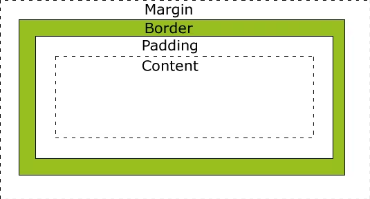
div { width: 300px; /* 这设置的是内容Content的宽度 */ border: 25px solid green; padding: 25px; margin: 25px;}<!DOCTYPE html><html lang="en"> <head> <meta charset="UTF-8" /> <title>Title</title> <style> div { width: 100px; /* 内容Content的宽度 */ height: 100px; /* 内容Content的高度 */ border: 10px solid red; /* 边框Border的属性 */ box-shadow: 52px 52px 5px #33e269; /* 阴影Shadow的属性 */ } </style> </head> <body> <div></div> <br /><br /><br /><br /><br /><br /><br /><br /> <img src="images/头像%20sakurakugu.jpg" alt="" /> </body></html> border-style 值
dotted: 定义一个点线边框
dashed: 定义一个虚线边框
solid: 定义实线边框
double: 定义两个边框。 两个边框的宽度和 border-width 的值相同
groove: 定义3D沟槽边框。效果取决于边框的颜色值
ridge: 定义3D脊边框。效果取决于边框的颜色值
inset:定义一个3D的嵌入边框。效果取决于边框的颜色值
outset: 定义一个3D突出边框。 效果取决于边框的颜色值
轮廓(outline)绘制在元素的外边距(margin)之外。
轮廓不会影响元素的尺寸或布局,只是用于视觉上的强调或突出显示。
用 outline 来声明,属性和边框的差不多
position: xxx;
相对定位:position: relative;
相对定位,相对自己原来的位置进行指定的偏移,相对定位的话,它任然在标准文档中,原来的位置会被保留(偏移的是投影)
定位:基于xxx定位,上下左右
1.没有父元素定位的前提下,相对于html标签定位
2.假设父级元素存在定位,我们通常会相对父级元素进行偏移
3.相对于父级或html标签的位置,进行指定的偏移,相对定位的话,它仍然在标准文档流中,原来的位置会被保留
就是图层
z-index:默认是0,最高无限(想置顶的话,写999就好了),可以负数(z-index:-1;)
用于定于元素的显示方式,
也就是控制元素的布局行为。它决定了元素在文档流中的呈现方式以及如何与其他元素交互。
block
元素显示为块级元素,占据一整行。
示例:<div>、<p> 默认是块级元素。
特点:
独占一行。
可以设置宽高。
支持内外边距(margin 和 padding)。
div { display: block;}inline
元素显示为内联元素,内容紧跟在同一行。
示例:<span>、<a> 默认是内联元素。
特点:
不独占一行。
宽高设置无效(仅由内容决定大小)。
支持内边距,但外边距(margin)的上下部分可能不起作用。
```cssspan { display: inline;}inline-block
结合了内联和块级元素的特性。
特点:
不独占一行(类似 inline)。
可以设置宽高(类似 block)。
button { display: inline-block;}none
隐藏元素,元素不占据任何空间(从页面布局中完全移除)。
常用于动态显示/隐藏内容。
.hidden { display: none;}flex
启用弹性布局(Flexbox)。
适用于构建复杂的布局,如水平居中、垂直居中等。
容器和子元素通过 flex 属性协作定义布局。
.container { display: flex;}grid
启用网格布局。
提供强大的二维布局能力,适合构建复杂的布局,如多列多行的布局。
.grid-container { display: grid;}table
<table>)元素的默认行为。.table-like { display: table;}其他常见值
inline-flex:与 inline-block 类似,但支持弹性布局。
inline-grid:与 inline-block 类似,但支持网格布局。
inherit:继承父元素的 display 值。
initial:恢复到默认值。
浮动,相当于绘画的图层,浮在某些图层上
/* CSS 的 Float(浮动),会使元素向左或向右移动,其周围的元素也会重新排列。 *//* 浮动的盒子可以向左浮动,也可以向右浮动,直到它的外边缘碰到包含框或另一个浮动盒子为止 */img { float:right; /* 右浮动 */ /* left right none inherit */}/* clear 属性指定元素两侧不能出现浮动元素 */.text_line { clear:both; /* left right none inherit both */}边框塌陷问题解决方案
方法2、4
<!DOCTYPE html><html lang="en"><head> <meta charset="UTF-8"> <title>浮动</title> <link rel="stylesheet" href="css/style.css" type="text/css"/></head><body><div id="father"> <div class="layer01"><img src="images/1.jpg" alt=""></div> <div class="layer02"><img src="images/2.jpg" alt=""></div> <div class="layer03"><img src="images/3.jpg" alt=""></div> <div class="layer04">我是一段文字</div> <!--方法2:增加一个空的div标签,清除浮动,另一部分在css中--> <div class="clear"></div></div></body></html>div{ margin: 10px; padding: 5px;}#father{ border:1px #000000 solid; /*height: 800px;*//* 方法1 增加父级元素的高度*/ /*overflow:hidden;!*方法3 的另一种表现形式,(记得恢复下面的.clean{})*!*/} /*方法4 伪类的方案,(记得恢复下面的.clean{})*/#father:after{/*在father后面执行一部分操作*/ content: ''; /*创造一个空文本*/ display: block; /*讲这个空文本变成一个块元素*/ clear: both; /*再将这个块元素清除浮动*/} /*方法2:增加一个空的div标签,清除浮动,另一部分在html中*//* .clear{ clear: both; margin: 0; padding: 0;} */ #content{ width: 400px; height: 200px; /* 方法3:形成滚动条 */ /* 当规定的文本超出了框(父级边框),也可以用下面的代码,用滚动条来解决问题 */ overflow: scroll;} .layer01,.layer02{ border: 1px #ff0000 dashed; display: inline-block; float: left; /*clear: both;*/}{ border: 1px #0000ff dashed; display: inline-block; float: left; /*clear: both;*/}.layer03{ border: 1px #006600 dashed; display: inline-block; float: right; /*clear: both;*/}.layer04{ border: 1px #ffff66 dashed; font-size: 12px; line-height: 24px; display: inline-block; float: right; /*它这两侧都不允许排,于是另起一行去排了*/ /*clear:both;*/}CSS 的伪类是一种特殊的选择器,用于选择处于特定状态的元素,或者表示不在 DOM 结构中的虚拟状态。例如,可以用伪类选择鼠标悬停的元素、表单中被选中的输入框等。
伪类可理解为系统自带的动态类。就是一种自带的标签,一部分是内置且隐藏的,一部分是会在满足特定条件时出现的。
伪类以 冒号 : 开头,紧跟在选择器之后:
选择器:pseudo-class { property: value;}:hover:选择鼠标悬停的元素。
button:hover { background-color: lightblue;}:active:选择被激活的元素(通常是鼠标按下但未释放时)。
a:active { color: red;}:focus:选择获得焦点的元素(如被点击或通过键盘导航到)。
input:focus { outline: 2px solid blue;}:checked:选择被选中的复选框或单选按钮。
input:checked { border: 2px solid green;}:disabled:选择被禁用的表单元素。
input:disabled { background-color: gray;}:required 和 :optional:选择必填或可选的表单元素。
input:required { border: 1px solid red;}:nth-child(n):选择某个父元素中第 n 个子元素(从 1 开始)。
li:nth-child(2) { color: blue;}:first-child 和 :last-child:选择父元素中的第一个或最后一个子元素。
p:first-child { font-weight: bold;}:only-child:选择父元素中唯一的子元素。
div:only-child { background-color: yellow;}:not(selector):选择不匹配指定选择器的元素。
p:not(.highlight) { color: gray;}:has(selector)(部分浏览器支持):选择包含特定子元素的父元素。
div:has(img) { border: 2px solid red;}:empty:选择没有子元素(包括文本节点)的元素。
div:empty { display: none;}:root:选择文档的根元素(HTML 中的 <html> 标签)。
:root { --main-color: #333;}:link 和 :visited:选择未访问或已访问的链接。
a:link { color: blue;}a:visited { color: purple;}<!DOCTYPE html><html lang="en"><head> <meta charset="UTF-8"> <meta name="viewport" content="width=device-width, initial-scale=1.0"> <title>伪类示例</title> <style> /* 鼠标悬停 */ a:hover { color: red; } /* 被选中的复选框 */ input:checked { border: 2px solid green; } /* 第一个列表项 */ li:first-child { font-weight: bold; } </style></head><body> <a href="#">悬停我试试</a> <br> <input type="checkbox" id="check"> <label for="check">选中我</label> <br> <ul> <li>第一个</li> <li>第二个</li> </ul></body></html>| 选择器 | 示例 | 示例说明 |
|---|---|---|
:checked |
input:checked | 选择所有选中的表单元素 |
:disabled |
input:disabled | 选择所有禁用的表单元素 |
:empty |
p:empty | 选择所有没有子元素的p元素 |
:enabled |
input:enabled | 选择所有启用的表单元素 |
:first-of-type |
p:first-of-type | 选择的每个 p 元素是其父元素的第一个 p 元素 |
:in-range |
input:in-range | 选择元素指定范围内的值 |
:invalid |
input:invalid | 选择所有无效的元素 |
:last-child |
p:last-child | 选择所有p元素的最后一个子元素 |
:last-of-type |
p:last-of-type | 选择每个p元素是其母元素的最后一个p元素 |
:not(selector) |
:not(p) | 选择所有p以外的元素 |
:nth-child(n) |
p:nth-child(2) | 选择所有 p 元素的父元素的第二个子元素 |
:nth-last-child(n) |
p:nth-last-child(2) | 选择所有p元素倒数的第二个子元素 |
:nth-last-of-type(n) |
p:nth-last-of-type(2) | 选择所有p元素倒数的第二个为p的子元素 |
:nth-of-type(n) |
p:nth-of-type(2) | 选择所有p元素第二个为p的子元素 |
:only-of-type |
p:only-of-type | 选择所有仅有一个子元素为p的元素 |
:only-child |
p:only-child | 选择所有仅有一个子元素的p元素 |
:optional |
input:optional | 选择没有"required"的元素属性 |
:out-of-range |
input:out-of-range | 选择指定范围以外的值的元素属性 |
:read-only |
input:read-only | 选择只读属性的元素属性 |
:read-write |
input:read-write | 选择没有只读属性的元素属性 |
:required |
input:required | 选择有"required"属性指定的元素属性 |
:root |
root | 选择文档的根元素 |
:target |
#news:target | 选择当前活动#news元素(点击URL包含锚的名字) |
:valid |
input:valid | 选择所有有效值的属性 |
:link |
a:link | 选择所有未访问链接 |
:visited |
a:visited | 选择所有访问过的链接 |
:active |
a:active | 选择正在活动链接 |
:hover |
a:hover | 把鼠标放在链接上的状态 |
:focus |
input:focus | 选择元素输入后具有焦点 |
:first-letter |
p:first-letter | 选择每个 元素的第一个字母 |
:first-line |
p:first-line | 选择每个 元素的第一行 |
:first-child |
p:first-child | 选择器匹配属于任意元素的第一个子元素的 元素 |
:before |
p:before | 在每个 元素之前插入内容 |
:after |
p:after | 在每个 元素之后插入内容 |
:lang(*language*) |
p:lang(it) | 为 元素的lang属性选择一个开始值 |
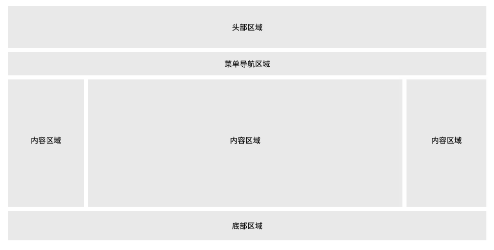
移动端、平板设备、PC桌面设备
<ul> <li><a href="#home">主页</a></li> <li><a href="#news">新闻</a></li> <li><a href="#contact">联系</a></li> <li><a href="#about">关于</a></li></ul>垂直导航栏
ul { list-style-type: none; margin: 0; padding: 0; width: 200px; background-color: #f1f1f1;}li { text-align: center;}li a { display: block; color: #000; padding: 8px 16px; text-decoration: none;}/* 鼠标移动到选项上修改背景颜色 */li a:hover { background-color: #555; color: white;}li a.active { background-color: #4CAF50; color: white;}水平导航栏
ul { list-style-type: none; margin: 0; padding: 0; overflow: hidden; background-color: #333;}li { float: left;}li a { display: block; color: white; text-align: center; padding: 14px 16px; text-decoration: none;}/*鼠标移动到选项上修改背景颜色 */li a:hover { background-color: #111;}.active { background-color: #4CAF50;}/* <li> 通过 border-right 样式来添加分割线: */li { border-right: 1px solid #bbb;}li:last-child { border-right: none;}/* 设置页面的导航条固定在头部或者底部 */ul { position: fixed; top: 0; /* bottom: 0; */ width: 100%;} /* 将导航条最右边的选项设置右对齐 (float:right;): */<li style="float:right"><a class="active" href="#about">关于</a></li>/**/<style>/* 下拉按钮样式 */.dropbtn { background-color: #4CAF50; color: white; padding: 16px; font-size: 16px; border: none; cursor: pointer;}/* 容器 <div> - 需要定位下拉内容 */.dropdown { position: relative; display: inline-block;}/* 下拉内容 (默认隐藏) */ .dropdown-content { display: none; position: absolute; background-color: #f9f9f9; min-width: 160px; box-shadow: 0px 8px 16px 0px rgba(0,0,0,0.2);}/* 下拉菜单的链接 */ .dropdown-content a { color: black; padding: 12px 16px; text-decoration: none; display: block;}/* 鼠标移上去后修改下拉菜单链接颜色 */ .dropdown-content a:hover {background-color: #f1f1f1}/* 在鼠标移上去后显示下拉菜单 */.dropdown:hover .dropdown-content { display: block;}/* 当下拉内容显示后修改下拉按钮的背景颜色 */.dropdown:hover .dropbtn { background-color: #3e8e41;}</style><div class="dropdown"> <button class="dropbtn">下拉菜单</button> <div class="dropdown-content"> <a href="#">菜鸟教程 1</a> <a href="#">菜鸟教程 2</a> <a href="#">菜鸟教程 3</a> </div></div><style>/* Tooltip 容器 */.tooltip { position: relative; display: inline-block; border-bottom: 1px dotted black; /* 悬停元素上显示点线 */} /* Tooltip 文本 */.tooltip .tooltiptext { visibility: hidden; width: 120px; background-color: black; color: #fff; text-align: center; padding: 5px 0; border-radius: 6px; /* 定位 */ position: absolute; z-index: 1;} /* 鼠标移动上去后显示提示框 */.tooltip:hover .tooltiptext { visibility: visible;}</style> <div class="tooltip">鼠标移动到这 <span class="tooltiptext">提示文本</span></div>* { box-sizing: border-box;} input[type=text], select, textarea { width: 100%; padding: 12px; border: 1px solid #ccc; border-radius: 4px; resize: vertical;} label { padding: 12px 12px 12px 0; display: inline-block;} input[type=submit] { background-color: #4CAF50; color: white; padding: 12px 20px; border: none; border-radius: 4px; cursor: pointer; float: right;} input[type=submit]:hover { background-color: #45a049;} .container { border-radius: 5px; background-color: #f2f2f2; padding: 20px;} .col-25 { float: left; width: 25%; margin-top: 6px;} .col-75 { float: left; width: 75%; margin-top: 6px;} /* 清除浮动 */.row:after { content: ""; display: table; clear: both;} /* 响应式布局 layout - 在屏幕宽度小于 600px 时, 设置为上下堆叠元素 */@media screen and (max-width: 600px) { .col-25, .col-75, input[type=submit] { width: 100%; margin-top: 0; }}分享你的想法,与大家交流讨论
Twikoo 加载失败
Twikoo 脚本加载失败